Shadows are one of the most powerful tools in a designer’s toolkit. They add depth, dimension, and realism to otherwise flat interfaces. Whether you’re styling UI components with CSS or working with images and SVGs, understanding the difference between box-shadow and drop-shadow can dramatically improve the quality of your designs.
In this guide, we’ll break down what each shadow type does, when to use them, and how to apply them correctly with practical examples.
What Are Shadows in Web Design?
In the real world, shadows appear when light is blocked by an object. On the web, we simulate this effect to:
- Create visual hierarchy
- Add depth and separation between elements
- Improve usability by signaling interactivity
- Add polish and realism to interfaces
There are two primary ways to create shadows in modern CSS: box-shadow and drop-shadow.
box-shadow: The CSS Workhorse
What Is box-shadow?
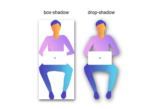
box-shadow is a CSS property that draws a shadow around an element’s bounding box. It does not care about the actual visible shape of the content. The shadow always follows the rectangular outline of the element.
Syntax
box-shadow: offset-x offset-y blur-radius spread-radius color;Parameters explained:
- offset-x: Horizontal offset (positive moves right)
- offset-y: Vertical offset (positive moves down)
- blur-radius: Softness of the shadow
- spread-radius: Expands or contracts the shadow (optional)
- color: Shadow color, usually semi-transparent
Basic Example
.card {
  box-shadow: 5px 5px 10px rgba(0, 0, 0, 0.3);
}
This creates a soft shadow pushed slightly to the right and downward.
When to Use box-shadow
box-shadow works best for:
- Cards, buttons, and containers
- Hover and focus states
- Layered UI layouts
- Performance-sensitive animations
Limitation to Be Aware Of
The shadow always follows the element’s box, not its visible shape. Transparent PNGs, SVGs, or irregular shapes will still get a rectangular shadow.
Practical Patterns
Subtle card elevation
.card {
  box-shadow: 0 2px 4px rgba(0, 0, 0, 0.1);
}
Floating effect
.floating-button {
  box-shadow: 0 10px 30px rgba(0, 0, 0, 0.3);
}
Inset (inner) shadow
.inset-box {
  box-shadow: inset 0 2px 4px rgba(0, 0, 0, 0.2);
}
Multiple shadows
.multi-shadow {
  box-shadow:
    0 2px 4px rgba(0, 0, 0, 0.1),
    0 8px 16px rgba(0, 0, 0, 0.1);
}drop-shadow: The Precision Tool
What Is drop-shadow?
drop-shadow() is a filter function that applies a shadow based on the actual visible pixels of an element. Transparent areas are ignored, so the shadow follows the real shape.
Syntax
filter: drop-shadow(offset-x offset-y blur-radius color);Key differences from box-shadow:
- Part of the
filterproperty - No
spread-radius - No
insetoption - Shape-aware
Basic Example
.icon {
  filter: drop-shadow(3px 3px 5px rgba(0, 0, 0, 0.4));
}
When to Use drop-shadow
drop-shadow is ideal for:
- PNG images with transparency
- SVG icons and logos
- Text over images
- Irregular shapes or clipped elements
Performance Trade-off
Because the browser must calculate visible pixels, drop-shadow is more expensive than box-shadow. Use it selectively, especially in animations.
Practical Patterns
Icon shadows
.logo {
  filter: drop-shadow(2px 2px 4px rgba(0, 0, 0, 0.5));
}
Text readability over images
.heading {
  filter: drop-shadow(1px 1px 2px rgba(0, 0, 0, 0.3));
}
Combining filters
.image {
  filter:
    drop-shadow(5px 5px 10px rgba(0, 0, 0, 0.3))
    brightness(1.1);
}
box-shadow vs drop-shadow
Shape Handling
Box shadow
.circle {
  border-radius: 50%;
  box-shadow: 5px 5px 10px rgba(0, 0, 0, 0.3);
}
Shadow remains rectangular.
Drop shadow
.circle {
  filter: drop-shadow(5px 5px 10px rgba(0, 0, 0, 0.3));
}
Shadow follows the circular shape.
Transparency
box-shadow: Ignores transparencydrop-shadow: Respects transparency
Performance
box-shadow: Faster, safer for frequent usedrop-shadow: Slower, best for specific elements
Real-World Use Cases
Product Cards
.product-card {
  box-shadow: 0 4px 6px rgba(0, 0, 0, 0.1);
  transition: box-shadow 0.3s ease;
}

.product-card:hover {
  box-shadow: 0 8px 16px rgba(0, 0, 0, 0.2);
}

.product-image {
  filter: drop-shadow(0 2px 4px rgba(0, 0, 0, 0.15));
}
Navigation Buttons
.nav-button {
  box-shadow: 0 2px 4px rgba(0, 0, 0, 0.1);
}

.nav-icon {
  filter: drop-shadow(1px 1px 2px rgba(0, 0, 0, 0.3));
}
Browser Support
box-shadow: Supported in all modern browsers (IE9+)drop-shadow: Supported in modern browsers including Chrome, Firefox, Safari, and Edge
Fallback example:
.element {
  box-shadow: 2px 2px 4px rgba(0, 0, 0, 0.3);
  filter: drop-shadow(2px 2px 4px rgba(0, 0, 0, 0.3));
}- Use
box-shadowfor structure, performance, and layout depth. - Use
drop-shadowfor precision, transparency, and irregular shapes.
Both tools solve different problems. Knowing when to use each is what separates average UI from polished, professional design. The best shadows are subtle, intentional, and barely noticeable.
Leave a Reply